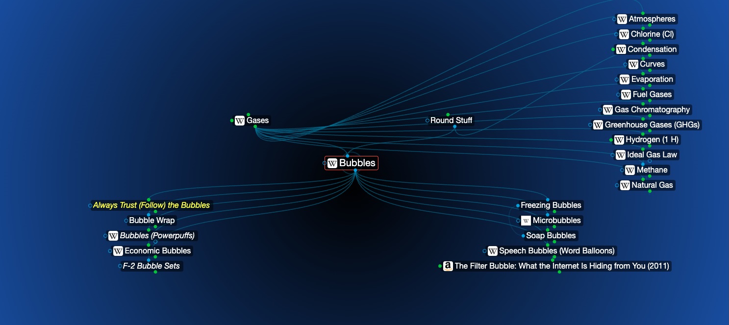
Where is "up"?
You should be able to follow the bubbles.
Sometimes in Scuba diving, you get disoriented. You might be in a cave, where every wall looks alike, or deep enough where it's dark and you can't tell where you are. Doing the wrong thing at those moments is life-threatening. Divers have a great saying for situations like this: "Always trust the bubbles." They will always show you the way to the surface.
One of my favorite aspects of TheBrain software is that it has a sense of orientation, a feeling of where "up" is. Compare this Brain screen:
With this "rubber band" diagram, where you can't really tell what is where. It's almost illegible.
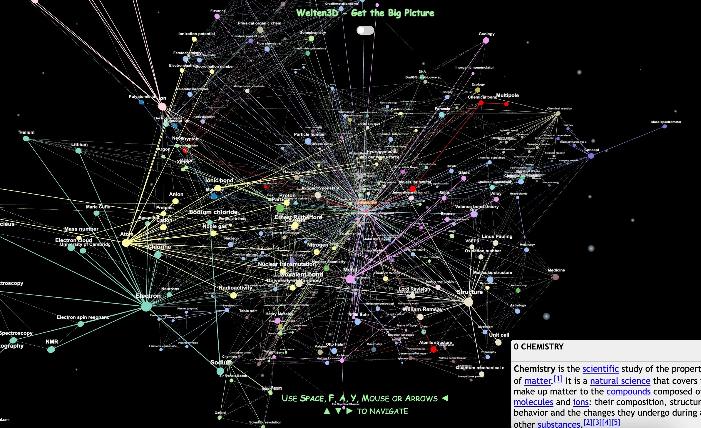
Okay, maybe that one's unfair; how about this one?
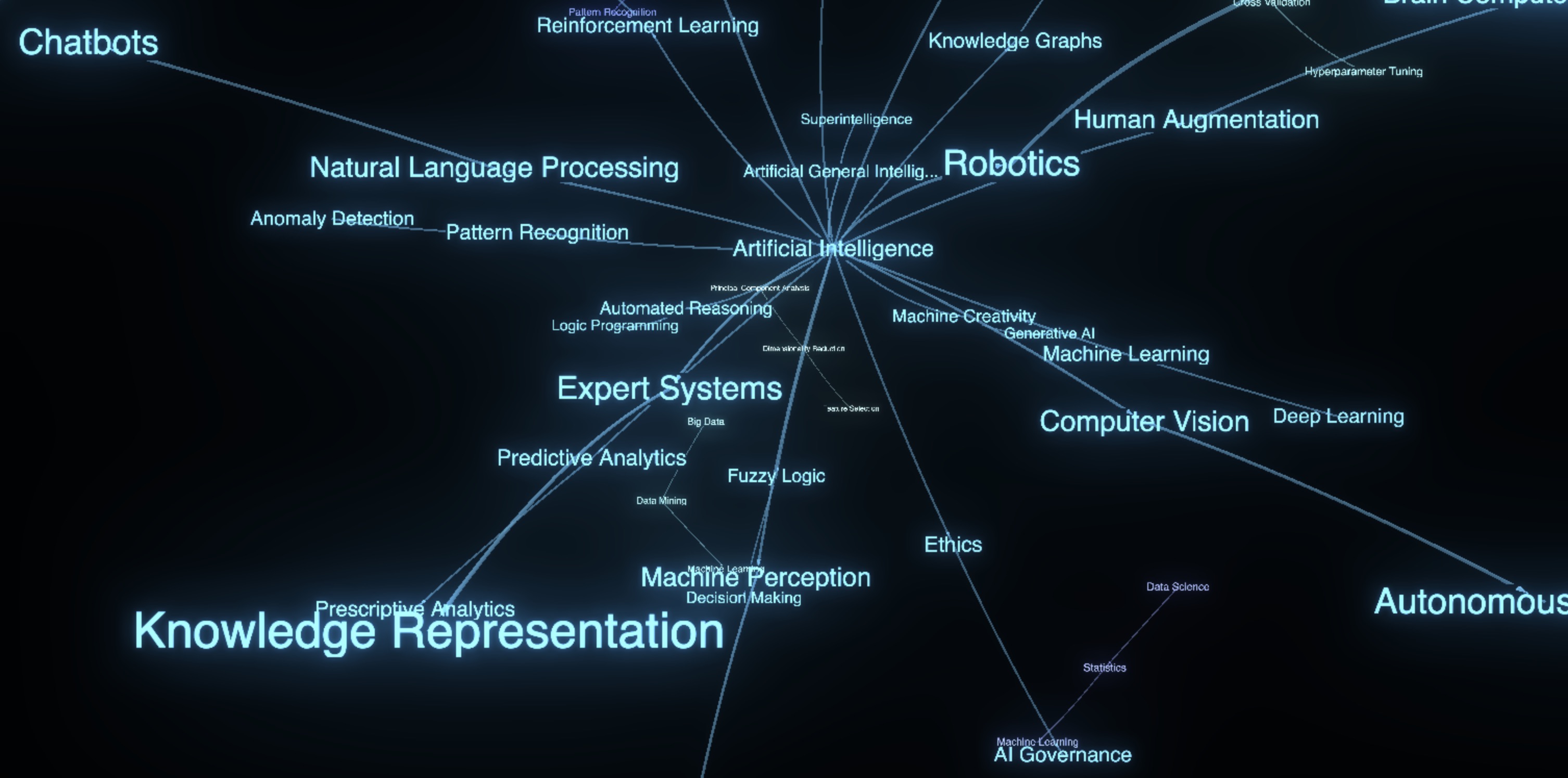
Many mind maps are attractive, but relatively useless. In 2005, Manuel Lima started a website called VisualComplexity.com, which went viral (but appears to have turned into a book site about visualization). Early on, though, it was a gallery of cool visualizations. You can get a feel for it from this Wayback capture.
One of the problems I had with the site was that a majority of the examples it highlighted weren't very useful. They were just flashy. And unfortunately, visualizations can often get by on being flashy. The problems arise when you try to navigate or curate them. When you start to make them practical, few pass the test.
What you want is a display that your eye and brain can parse and comprehend easily. This is way harder than it sounds. Having a consistent sense of orientation is one of the ways to make a mind map more legible.
From my perspective, after almost 29 years of constant use, TheBrain passes the practical (vs flashy) test with flying colors. This Braincast is about one attribute that makes TheBrain special (of several):
This article is cross-posted on Substack here and LinkedIn here. It's also here in my Brain.